Responsive Editing Mode
Responsive Editing Mode lets you preview pages as they appear on medium and small devices and edit them directly in that device size view.
The Beaver Builder editor's default layout is for large screens, and Responsive Editing Mode makes it much easier to adjust the settings for medium and small devices. If you prefer, you can enter Responsive Editing Mode immediately and build a mobile layout, then adjust for larger screens. Either way, chances are that as you work you will want to tweak your original design to optimize it for every device size.
Enter Responsive Editing Mode in any of the following ways:
- Click the responsive settings icon next to settings that have it for a row, column, or module.
Your page view will stay in responsive editing mode even if you close the Settings window. Use the Exit button to close responsive editing. - On the Tools menu, click Responsive editing.
- Type the keyboard shortcut R
This keyboard shortcut toggles responsive editing mode to open in medium device view, change from medium to small device view, and close the responsive editing window.
Note that keyboard shortcuts are always lowercase letters.
Here's an example in which we start with a large layout and tweak the medium and small versions.
Large screen
The following screenshot shows a single row with a background image and two column groups with two columns each. In this example, all of the column margins are set to 80px.
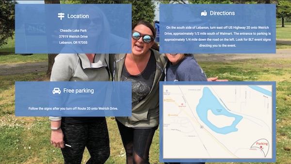
A best practice for large screens is to zoom in and out on your browser to test that the layout will look good to users at the magnification they prefer. Holding down the Ctrl key (or the ⌘ key on Mac), click + or - on the keyboard to magnify and shrink the text, images, and videos respectively. Make any corrections to your large display so it looks good at a range of zooms.
Medium screen
Enter Responsive Editing mode, and you'll immediately see the medium-screen display for a prototypical tablet device in portrait orientation, as shown in the following screenshot.
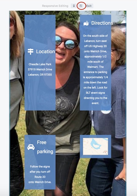
Immediately you can see that the column are now too small for the content, and the headings are bleeding across the column border because the font is too big. One solution is to adjust the Icon modules so the icons and text are smaller, but the columns are just too narrow, so our solution is to change the column margins from 80px to 40px on medium devices.
To do this, open each of the four column settings, and click the Advanced tab. The Margins field automatically displays the setting for medium devices, as you can see by the tablet icon displayed next to the Margins label. Because we haven't set a value yet for medium size, the field values are initially empty. Set one margin value to 40 and click the Link values icon to synch all four values, as shown in the following screenshot. When this toggle is active, the icon displays in blue.
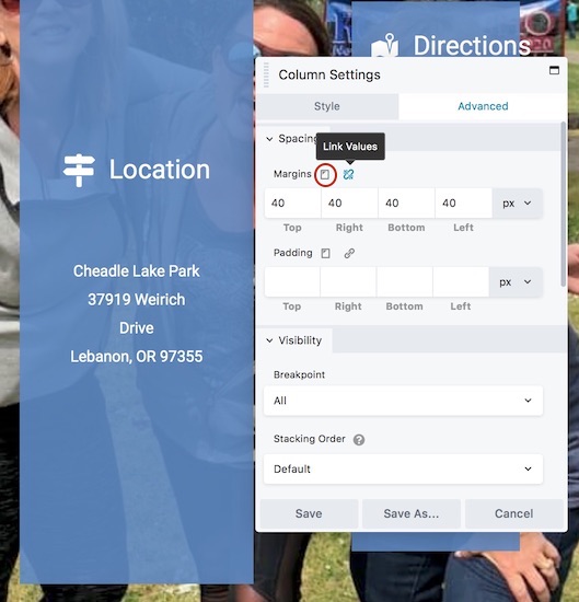
That initial change doesn't look so good, but once you set all four columns, the result is much better, as the following screenshot shows.
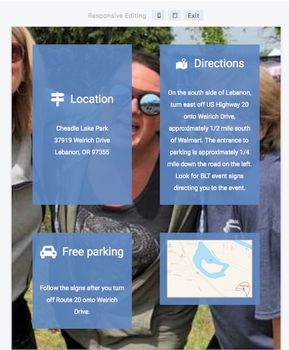
You can further tweak text size and icon size for medium size devices. You can also set a different row background image for medium size devices.
Good idea to save your layout at this point. When you publish, the screen returns to the default large screen, and the large screen layout may not look right. Clear your caches, especially your browser cache, and that should fix the display.
Small screen
Repeat this process for mobile by entering Responsive Editing Mode and then clicking the phone icon. The following screenshot shows mobile view before any mobile-specific changes made to settings
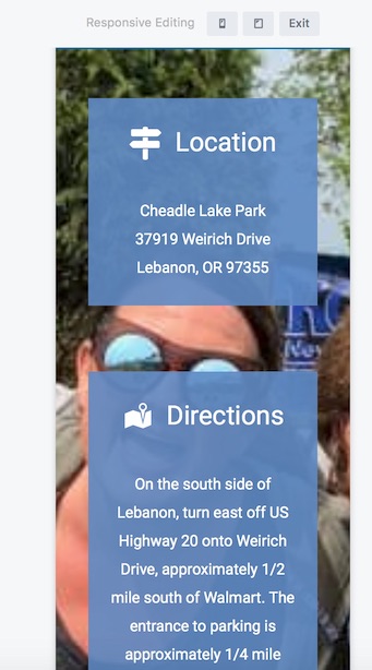
Make sure the columns have stacked the way you expected them to. You can reverse the stacking order, or you can prevent stacking by adding column width values in the small-device column settings. For example, to preserve the layout from the large screen used in this example, set each of the four column widths to 50%.
You can adjust the column margins specifically for mobile. In the following screenshot, we set the column's top margin to 20px and clicked the Linked values icon toggle to set the same value for all four sides for small devices.
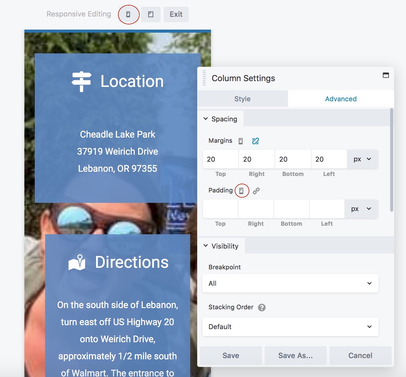
By default, Beaver Builder enables auto spacing on small devices, which automatically adjusts margins and padding to reduce the need to make a lot of manual adjustments. If your results for small devices are not what you expect, see this article on troubleshooting margins and padding.
Do other checks
Don't rely only on the view Responsive Editing Mode. Mobile devices in particular have many different screen sizes, and specific differences between devices can still pop up. Expand your device checks by using various simulators and emulators.