The Advanced tab for rows, columns, and modules
The Advanced tab offers nearly identical settings on all Beaver Builder rows, columns, and modules.
Spacing section
For rows and columns, you can change the default margin and padding values. For modules, you can change the default margin values only.
Lock and unlock the spacing settings
You can lock the four margin margin and padding settings so that you can enter one value into any field and all four settings (left, top, right, bottom) show that value. Click the Lock icon, circled in orange, to lock the settings and click it again to remove the lock:
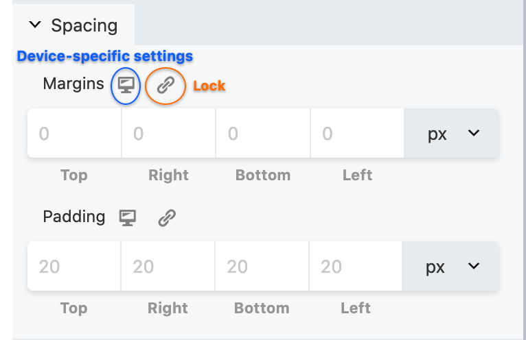
Add specific spacing settings for device size
Using the icon circled in blue, you can add settings for each device size or let Beaver Builder handle the smaller devices automatically. Start with this article for information about margins and padding before you start making individual changes on the Advanced tab.
Visibility section
In the Breakpoint field, you can limit the display of the row, columnm, or module to particular device sizes. See this article for more information about global and custom breakpoints.
In the Display field, you can choose to display the row, column, or module always, never, or only to logged-in or logged-out users. If you have Beaver Themer installed, you can also use conditional logic for many more options controlling when the row, column, or module is displayed.
Animation section
You can assign an entrance animation, which activates the first time the page is loaded and the row, column, or module comes into view. The default is None.
If you choose an entrance animation, set the delay (how long before the animation starts, in seconds) and a duration (how long the animation lasts, in seconds.)
HTML Element section
- You can choose a different HTML container element for the row, column, or module (advanced users only).
For example, for reasons of accessibilityy you might want to use an HTML container tag that has more semantic value than a<divtag, such as<section>. - Add a CSS ID or class value to the row, column, or module.
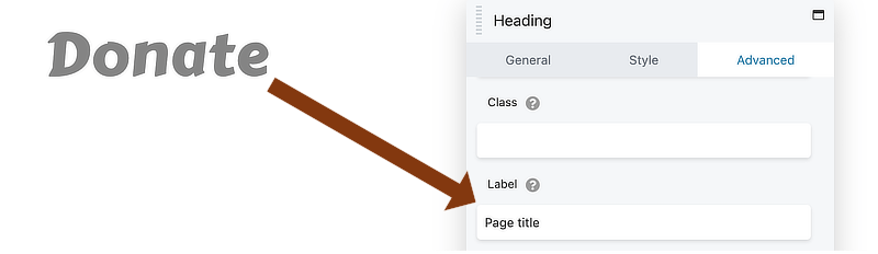
ID names must be unique on a page, so assign an ID only when you need to reference that unique ID. For example, a link to an anchor on the page requires a unique anchor so it know exactly where to go. Class names are usually intended for reuse and are often used in CSS rules. For example, you might want to assign a different text size to all HTML headings with anfl-headingclass. - You can add a Label to your row, column, or modules to help identify their purpose in the Beaver Builder editor, such as in Outline view.
For example, In the following screenshot, Page Title was added to Advanced > HTML Element > Label in a Heading module.
If you want to link to an anchor somewhere on the page, the row is the preferred place to set the anchor by creating an ID on the Advanced tab of the row. See the article on smooth scrolling for instructions.