Breakpoints for device sizes
Breakpoints, define the browser screen width at which responsive behavior changes from large devices to medium to small. The widths are set in pixels.
You can customize the global breakpoint values. Breakpoint values set in the Beaver Builder plugin control content area layouts and Beaver Themer layouts. Breakpoint values set in the Beaver Builder Theme control header and navigation responsive behavior.
Breakpoint values in the plugin and theme
Because of differences in architecture between the Beaver Builder plugin and Beaver Builder Theme, the defined breakpoint values are one pixel different in determining device behavior, as shown in this table.
| Large devices | Medium devices | Small devices | |
|---|---|---|---|
| Default breakpoint value (plugin and theme): browser width | undefined | 992px | 768px |
| Browser width range | Plugin: 993px and higher Theme: 992px and higher | Plugin: 769-992px Theme: 768-991px | Plugin: 768px and lower Theme: 767px and lower |
Examples of customizing breakpoints
Make portrait orientation on iPad a medium-sized device
The display width of many iPad models is 1024x768px for landscape orientation and 768x1024px for portrait orientation, making landscape orientation a large device and portrait orientation a small device for plugin layouts. Suppose you want to use the Visibility setting on the Advanced tab to display one row for tablets in both orientations but a different row for phones.
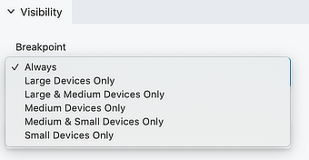
As you can see in this screenshot, the Visibility > Breakpoint setting on the Advanced tab has a choice of Large & Medium devices only, which would accomplish your goal if portrait orientation fell into the category of a medium-sized device, but it is one pixel short of that.
By changing the plugin's global breakpoint from 768px to 767px you'll make the iPad's portrait orientation a medium device.
Use the mobile nav for larger devices
If you use a Beaver Builder Theme header, by default the responsive nav Hamburger icon or MENU link is used for small devices, but you can change that behavior at Appearance > Customize > Header > Nav layout > Responsive Nav Breakpoint.
For a Menu module in a Beaver Builder or Themer layout, there's a Responsive section on the module's General tab where you can set the menu style and device size.
Preserve the theme's header layout on medium devices
If you want to keep the Beaver Theme's Nav Left, Nav Right, and Nav Centered + Inline Logo header layouts intact on medium devices instead of changing to the Nav Centered layout, set the Medium device breakpoint at Appearance > Customize > General > Layout to match the mobile setting, which by default is 768px. This keeps the same header layout at both landscape and portrait orientation on the models of iPads whose portrait orientation is 768px or higher. Tweak this setting if you want to include other tablets, but also make sure that your menu is readable and tappable at portrait orientation.