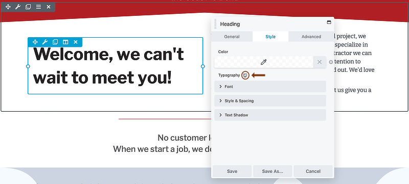
Responsive Settings icon
In the Settings panel for any row, column, or module, you can set a different value for each device size anywhere you see this desktop icon:
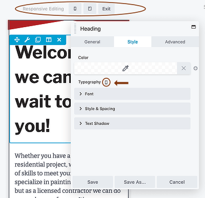
When you click the icon, the icon changes from desktop to tablet and the layout goes into Responsive Editing Mode for medium-sized devices.
Click the icon again and it changes to a mobile icon, with the mobile view in Responsive Editing Mode:
By default, setting a single value applies to every device size. With Beaver's Builder's automatic responsive adjustments, you often don't have to tweak the settings any further. But you can fine-tune the settings at each device size if you want.
The responsive settings occur most often for the following settings:
- Margin and padding settings on the Advanced tab and Style tab of rows, columns, and modules
- Typography section settings in modules
- Border section settings in rows, columns, and modules
- Alignment settings in modules.
- A few specific options that relate to height, width, or spacing within or between modules.