Prevent column stacking with custom widths
You can prevent column stacking on smaller devices by setting column widths differently for each device size.
For example, here's a column group with two columns, in which the columns have equal widths of 50% on large devices, as shown in the top screenshot. For medium devices (tablets), shown in the middle screenshot, the width of the left column was set to 20% and the right column to 80%. For small (mobile) devices, shown bottom screenshot, the width of the left column was set to 35% and the right column to 50%. You can see that the narrower columns are left-aligned in their space.

Column widths set for medium and small devices can be set to total less than 100% for the columns in a column group, as shown in the in the last screenshot above, in which the left column is 35% and the right column is 50%.
If you set a large-device value for one column, the values in the other columns in the column group will be adjusted automatically to total 100%. This isn't true when you set column width values for medium and small devices.
For this reason, if you set a width value for a medium or small device, it's a best practice to set an explicit value for all the other columns in the same column group.
If you change the default breakpoints under global settings, it will
affect the point at which the column width changes for medium and small
devices. The default breakpoints in Beaver Builder are 992px and 768px.
To change the width of columns by device size:
- Open Column settings for one of the columns.
- On the Style tab in the Width field, set the percentage for large devices in the normal fashion.
As an alternative, you can use the column drag handle to adjust the column width for large devices. See this article for a screenshot of the column drag handle. - Click the responsive toggle to enter Responsive Editing Mode.
The responsive toggle icon is shown in the the following screenshot.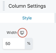
The view when you enter Responsive Editing Mode is for medium devices, and the values are empty because they are inheriting the setting from the large screen. - If you want to block column stacking for medium devices, enter the % width that you want for that column.
- If you want to block column stacking for small devices, click the responsive toggle again and enter the % width that you want for small devices for that column, or use the column drag handle in the layout.
If you leave the Width value blank, it will inherit the value from the medium device setting. - Repeat these steps for each column in the group that you want to modify.