Choose how menus open responsively
You can choose how menus open when you click the Hamburger icon or MENU button: either a dropdown or flyout animation. This setting is located at Customize > Header > Nav layout > Responsive nav layout.
The following options are available and are described in the sections to follow. The menu behavior is the same whether you click a Hamburger icon or a Menu button or label.
- Dropdown (default)
- Flyout overlay
- Flyout push
- Flyout push with opacity
Responsive menu dropdown
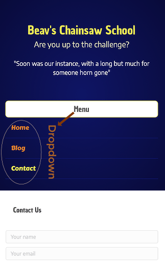
The Dropdown-style mobile menu appears below the header, as shown in the following screenshot on a mobile device. This option is a dropdown push, in that the menu pushes down the page content as it opens.
Figure 1: Dropdown-style responsive nav layout

Flyout overlay
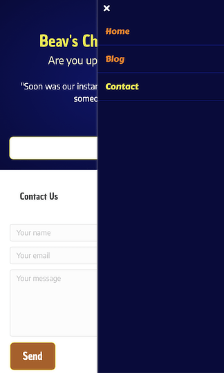
With Flyout overlay, the menu flies in from the left or right (depending on the Responsive nav layout position setting) and overlays the main screen, as shown in the following screenshot. The menu background is the same color as the header background, though it appears darker in the screenshot because the header background has a gradient.
Figure 2: Flyout Overlay responsive nav layout

Flyout push
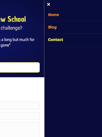
With Flyout push, the menu flies in from the left or right (depending on the Responsive nav layout position setting) and pushes the main screen to the side, as shown in the following screenshot.
Figure 3: Flyout Push responsive nav layout

Flyout push with opacity
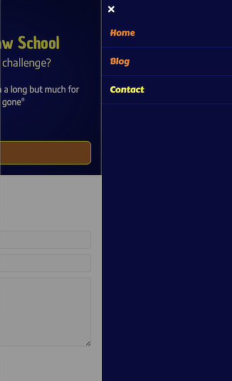
With Flyout push with opacity, the menu animation is the same as for Flyout push but additionally the visible portion of the main screen has a semi-transparent dark overlay, as shown in the following screenshot.
Figure 4: Flyout Push with Opacity responsive nav layout

Related information
See the following articles for more information about mobile menus.