Overview of full-width and boxed pages and rows
Beaver Builder Theme has settings in Customize > General for both page layout (fullwidth, boxed) and content width. Both settings control width in the theme header and footer, not in the content area.
Full-width page example
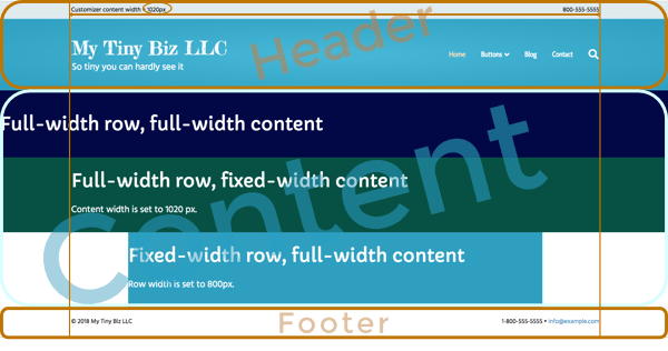
Here's an example in which Customize > General > Layout > Width is set to Full width and Content width is set to 1020px. The header and footer background colors take up the entire browser width, whereas the content in the header and footer is limited to a maximum width of 1020px.

As the browser width decreases, the distance between the row edges and the content in the header and footer grows smaller but never disappears, because a minimum distance of 80px is maintained. Once the responsive breakpoint is reached, the header may change to a different header and nav layout, as described in the article about the Customizer > Header settings.
Boxed page example
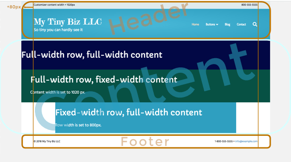
A boxed layout means that the web page appears in a box in the browser, with space appearing around the box if your browser screen is sized larger than the box size. Here's an example in which Customize > General > Layout > Width is set to Boxed and Content width is set to 1020px.

You don't have to enter the width of the box – it's automatically calculated by adding 80px to the content width.
Boxed layouts give you a couple extra settings in Customize > General > Layout. There's a Spacing field, which lets you change the distance between the top and bottom of the box and the top and bottom of the browser window, and you can alter the size of the drop shadow that appears around the box edges to give the box a 3D appearance.
Beaver Builder sets the row and content width in layouts
Row and content width in the content area of the page is set in the Beaver Builder editor, either in Global Settings or in individual rows. The screenshots in the previous sections show a content area with various row and content widths so you can see how they compare to the Customizer layout settings in the header and footer areas.
If you want content width in your Beaver Builder layouts to match the theme's header and footer content width, use the same width in Customize > General > Layout > Width and the row Max width setting in the Beaver Builder editor's global settings.
The article about full-width and fixed-width row layouts provides more information about these layout settings.
If you use Beaver Themer to design layouts for headers and footers, use the Beaver Builder editor to choose the row and content width. These settings will override the Customizer layout settings on the pages in which the Themer layout appears.