Full width and fixed width
When you create a row in Beaver Builder, you can specify whether the row is full width or fixed width. If you set the row to full width, you also have a choice of whether the row's content is full width or fixed width.
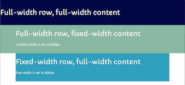
Here's a screenshot of some rows to illustrate the three choices of row width and content width. To keep it simple, the margins and padding on rows, columns, and modules are all set to 0px. See the description of each row in the following section.

Row 1: Full-width row, full-width content
When row width is set to full width, the row background stretches to either the full width of the browser or the full width of the page's boxed content area, a choice set by the theme.
When the content is also set to full width, it likewise stretches to the full width of the screen or boxed area. With this setting, you'd use row, column, or module margins and padding to move the column or content away from the left and right edges of the page.
Setting a row margin will move the row background away from the edge of the page, something you usually don't want because it also moves your row background away from the edge. Setting a row's padding keeps the row background at the page edges but pushes the column away from it. See this article for more information about margins vs. padding.
Row 2: Full-width row, fixed-width content
In the second row, the row is set to full width, and content is set to fixed width. The default fixed-width setting is 1100px, but you can change it, either in Beaver Builder's global settings or for individual rows. In this example, content width is set to 800px. This means that with no margins or padding, the column and the module are 800px wide and centered horizontally on the page. In the example shown in the screenshot above, the heading and text are left-justified within that content width.
When you set a fixed width, you are actually setting the max width. A fixed-width setting of 800px means the width will never be more than 800px wide, but it will shrink as screen size decreases, to ensure the layout is responsive.
Row 3: Fixed-width row
In the third row, row width is set to Fixed. This means the row background will stretch to a custom width that you specify, or to a global value you have set for row width, or to the default fixed width of 1100px. The fixed-width setting is the max width, like the previous example.
When the row is set to fixed width, the content is automatically set to the same width minus any margin and padding settings. You can compare Rows 2 and 3 in the screenshot to see the difference between setting the content width to 800px and setting the row width to 800px. The content in Rows 2 and 3 is vertically aligned, but the width of the row background color is different.
See this article for how to set row and content width.