Change default row and module margins and padding
Beaver Builder has the following default margins and padding that set the initial values when you open an individual row or column for editing. These settings are the same on all sides (top, bottom, left, right) and on all devices.
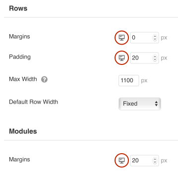
Beaver Builder default margins and padding
| Type | Built-in default |
|---|---|
| Row margins | 0px |
| Row padding | 20px |
| Column margins | 0px |
| Column padding | 0px |
| Module margins | 20px |
| Module padding | n/a |
Individual content modules have no padding.
If you find yourself making the same change to row or module margin settings or row padding, it might be more efficient to change the setting at the global level, Keep the following points in mind:
You can change default margins and padding for rows, and you can change the default margins for modules.
You can't change the defaults for columns, and modules have no padding.The default value applies to all sides. In other words, you can't set different default values for top, bottom, left and right.
You can set the defaults differently for each device size. If you set a value for desktop only, the tablet setting will inherit this value. The mobile value is controlled by auto spacing. If auto spacing is disabled, the mobile value is inherited from the desktop value. See the article on troubleshooting margins and padding for more details about how mobile values are determined.
To change default margins and padding site-wide
- Open one of your pages in Beaver Builder.
- In the upper right corner, click Tools > Global Settings.
- To change the global values for rows, go to the Rows section and change the Margins and Padding values.
- To change the global values for modules, go to the Modules section and change the Margins value in the Modules section.
- You can toggle through the device views to check the settings per device. Click the desktop icon in each row to change to tablet and mobile view, as shown in the following screenshot.
It's good to check, because a margin setting you apply to desktop will automatically apply to all three device sizes, but a padding setting you apply to desktop will apply only to large devices.
- Click Save to save your settings and exit the Tools area. You can exit Beaver Builder using any method.