The Typography section
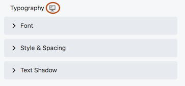
Many of the modules that allow text now have a standard Typography section, as shown in the following screenshot and described below.

Next to the Typography heading there's an icon for responsive settings. Click this icon to add different settings for medium and small devices. If you don't add settings for each device size, the settings for the desktop will apply to all.
The Typography section has the following subsections:
Font
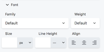
The Font subsection has the following settings:

Family
Set the font family here: a system font or any of the Google fonts.
Weight
If you chose a system font in Family, you can choose Light, Normal, or Bold in the Weight field. If you choose a Google font, the Weight field lists any of the styles included with that font. For example, the Google Cabin font includes Normal, Medium, Semi-Bold, and Bold. The Google italic forms of the font family can be selected in the Style field of the Style & Spacing subsection. If you select a custom web font in Family, the Weight choices are limited to the weights you configured for your font.
Size
Choose the font size, with px, em, rem, or vw as the unit of measurement. If this field is empty, the default setting is used. See this article comparing these CSS height and width units in more detail. :::
Line height
Set the amount of space used for lines of text. Specify a number value and a
unit of measurement. The dash value in the units list, shown in the screenshot
below, means a unitless value, which means the number value is multiplied by
the element's font size. In most cases this is the preferred way to set line
height, but you can also choose px or em. If this field is empty, the
default line height is used.

Align
Select one of the icons to align the text to the left, center or right. The
buttons in this setting are toggles. If no button is selected, the default
alignment is used.
For more information, see the article on the alignment setting.
Style & Spacing
This subsection includes the following settings.
Spacing
Controls the horizontal spacing between letters, in pixels.
Transform
Allows you to change the case of the text string without retyping. It
corresponds to the CSS text-transform property.
The choices are, from left to right: Normal (as typed), capitalize the first
letter of every word, convert all letters to uppercase, and convert all
letters to lowercase.
Decoration
The choices are Default (whatever decoration is already set in the CSS for that element), None (which overrides any default decoration), Underline, Overline, and Line through.
Style
This setting corresponds to the font-style property and is used for italic and oblique settings. The Style field offers the choices of Default (whatever style is inherited), None (font is regular, meaning upright, not italic or oblique), Italic, or Oblique.
- If you set Style to Italic, Beaver Builder loads the italic version of the font family you selected, if one exists. If not, the browser provides a computer-generated italic version of the font.
- Here's a good article on the difference between italic and oblique fonts and the difference between glyphs designed by a typographer and computer-generated versions: TypeTalk: Italic vs. Oblique.
Variant
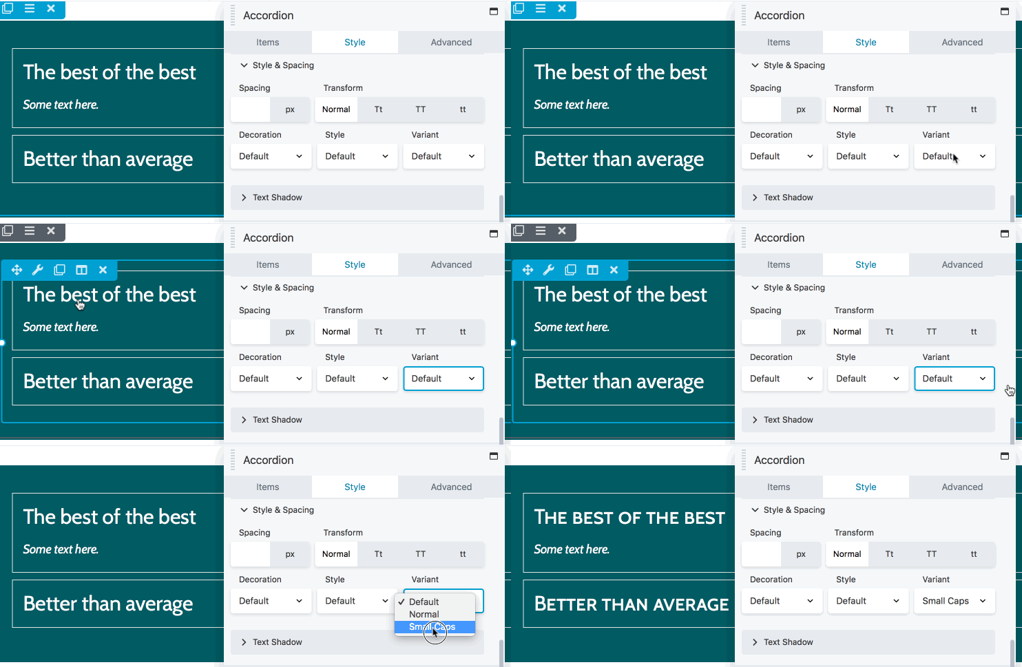
This field offers the choices of Default (whatever style is inherited), None (font is regular, meaning upright, overriding any inherited variant setting), or Small caps. The difference between Small caps and the Transform field's Uppercase is that Small caps uses larger letters for letters that are capitalized in the original text, whereas Uppercase uses capital letters of uniformly equal height. The Small caps effect is shown in the animation below.

Text shadow
A text shadow effect adds a shadow behind the text, letting you control the shadow color, direction of offset ( X is horizontal, Y is vertical), and blur, as shown in the following screenshot, in which the shadow is moved to the right and down with enough blur to preserve the shadow on individual letters but not make the background shape distinct.
