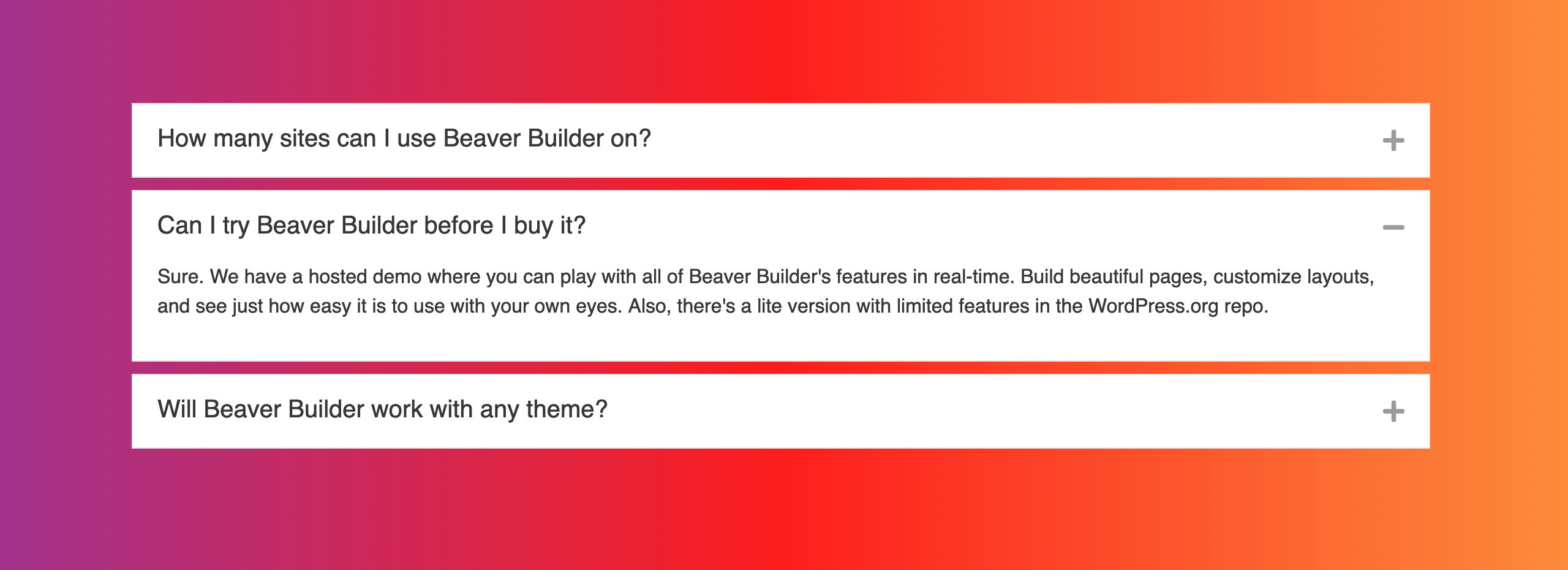
Accordion
The Accordion module lets you present a variety of content by expanding and collapsing the text, saving space while maintaining a professional appearance.

Usage
An accordion is great for whenever you have a list of items with details that you don't want to clutter the main page with but want the information easily accessible. Here are some good uses for the Accordion module:
- FAQs
- Q&A
- Feature Lists
Items tab
In the Items section, you can add, edit, and remove accordion content items.
Content Source
The content source allows you to determine what content is displayed. You can choose between posts and custom content.
Post
The Post content source option allows you to automatically populate the Accordion module with pages, posts, or custom post types.
- The post title becomes the item label of the Accordion item.
- The featured image does not appear in the Accordion item.
- Post info (author, date, categories, or tags) is not displayed.
Post Type
Select the post type you wish to populate the Accordion module with. You can choose pages, posts, or a custom post type, such as WooCommerce Products or a custom post type that you created yourself.Posts Per Page
Determines how many accordion items are created. Each item contains one page, post, or custom post type. The default is 5.Order
Choose between descending or ascending.Order By
The choices are: Author, Comment count, Date, Date last modified, ID, Menu order, Meta value (alphabetic or numeric), Random, Title, Selection order.See the Order By section in the Post module for more information.
Filter By
The Filter section allows you to include or exclude a set of posts, pages or custom post types by title, and taxonomy.See the Filter section in the Post module article for more information regarding the filter options.
Custom Content
The Custom Content source option allows you to add your own content using the WordPress classic editor or populate the accordion item with content from a saved row, column, module, or template.
Edit items
When you first add an Accordion module to your layout, a blank item will be created for you to edit. To edit an item, click the Edit Items link.

Add items
To add more accordion items, click the Add Item button.
Label
Enter a name for your accordion item. This appears in the Accordion module settings panel to identify the item and on the frontend.
Content Type
The choices are: Saved Row, Saved Column, Saved Module, Saved Template, and Custom Content. The Saved content drop down menu automatically lists all previously saved rows, columns, modules, or templates when you select Saved content.
The Custom Content option allows you to add your own content using the WordPress classic editor.
Shortcodes used too frequently on the same page or post may impact performance.
Content
Use the WordPress classic editor to add text to your accordion item. You can also add images using the Add Media button.
Item Actions
Each accordion item has a set of icons which perform the following actions:
- Move (drag & drop into position)
- Duplicate the item
- Delete the item

Display
The Display section contains the following options:
Collapse inactive
By default set to Yes, which allows only one item to be expanded at a time. Change to No to allow more than one item to be expanded,Expand first item
By default set to No. If set to Yes, the first item will be expanded on the first view, before the user clicks to expand anything.
After you save a label and text in the first item of the Accordion module, it remains open in the editing screen even when the Expand first item field is set to No. This is so that you can see the style settings while editing. The published page correctly follows the Expand first item setting.
Style tab
In the Style tab, you can change the color of the accordion items, such as the text and icon color, the border color, and more.
Item
Item Size
Changes the Accordion item size with specific padding values.- Small - Sets the padding to
10px 15px. - Medium - Sets the padding to
15px 20px. - Large - Sets the padding to
20px 25px.
- Small - Sets the padding to
Item Spacing
Control the spacing between accordion items.Item Border
The Border section has settings for border, radius, and shadow.See the Borders article for more information.
Label
Text Color
Set the text color of the Accordion label.Background Color
Set a background color for Accordion label.Padding
Set a specific padding value in pixels for the accordion label. Click the Link Value icon to automatically make all four padding values the same.Typography
Set the font size, family, line-height and more for the Accordion label. See the Typography article for more information.
Icon
Icon Position
Set the position of the accordion expand and collapse icons. The Left option positions the icon before the accordion label.The default is Right.
Icon
Choose a custom icon that replaces the default icon.Active Icon
Choose a custom icon that replaces the default icon.
Content
Text Color
Set the text color of the Accordion content.Background Color
Set a background color for Accordion content.Padding
Set a specific padding value in pixels for the accordion content. Click the Link Value icon to automatically make all four padding values the same.Typography
Set the font size, family, line-height and more for the Accordion content. See the Typography article for more information.
Advanced
There are all the usual Advanced tab settings for margins, visibility, animations, and advanced HTML settings.